United Classifieds — Nehnuteľnosti.sk · 2025
How to find a property when the user doesn’t know where to look
Nehnuteľnosti.sk is a leading Slovak real estate portal for buying, selling and renting. More than 72,000 active listings, over 1,800 agencies and over a million users every month. Its most important feature, search, was the one people kept overlooking.
| Role | Senior Product Designer: research, user testing, UI design and prototyping |
| Product | Homepage search and the search results page, desktop and mobile |
| Methods | Analytics, Hotjar, surveys and user feedback · 5-second test · task-based user testing · System Usability Scale · prototype testing · in-depth interviews |
| Result | A search bar that looks like a search bar, unified inputs, location chips and last search · 300+ reactions after release highlighting clarity, intuitiveness and mobile usability |
The problem
A search bar nobody saw
as a search bar
The search field on the homepage often wasn’t recognised as a search bar. Visually it didn’t look like a place to click and start searching. At the same time, many elements at the top of the page pulled attention elsewhere, and the popups opening from the inputs were inconsistent.
So the key feature stayed unnoticed. Based on data from Analytics, Hotjar, surveys and user feedback, we decided to redesign the top of the page, including the search bar.

In a 5-second test, the search bar was only the fourth thing people noticed.
- 1stThe background image and its characters, read as a banner
- 2ndThe house animation above the services
- 3rdThe red badge with the property count
- 4thOnly then the search bar
What was getting in the way
Too loud around it, too quiet inside it
Homepage header
- A large background image with characters placed right under the search bar.
- A red “flag” with the number of properties that looked like a button.
- A house animation.
- Heavy service tiles: thick outline, shadow, large box, colourful icon, bold text.
Search field
- Inputs didn’t feel clickable or interactive.
- No clear contrast or hierarchy between placeholder text and selected values.
- Changing or removing selected items was problematic.
Input content
- Location, offer and property popups each looked different.
- Working with locations was problematic when selecting several of them.


Testing the current search
Let’s not make the problem even worse
Before deciding on major changes, I thoroughly tested the current version of search. Only this way was it possible to design a solution that would really help users.
We wanted to know
- how users perceive the design and layout of the search bar,
- how they search for location, offer type and property type,
- how they handle adding multiple locations,
- how they use advanced filters,
- how easily they can complete assigned tasks.
5-second test
Each session started with a short intro and an explanation of the purpose. Then participants saw the page for just five seconds and answered what they remembered and how they perceived it. The test shows first impressions, memorability and clarity of content.
We asked: What caught your attention first? What do you remember? Were you confused or surprised by anything?
Four tasks on the live search
| Type | “Find a 3-room apartment for sale in Žilina.”Do they tell property types apart and pick the right one? Focus: location, offer, property type. |
| Offer | “Find a garage for rent in Košice, Ťahanovce.”Do they find and correctly use the “Offer” select? Focus: location, offer. |
| Filters | “Find an apartment for sale in Bratislava up to €260,000.”Do they find the search field and set basic parameters? Focus: location, menu, advanced filter. |
| Two cities | “Find a 3-room apartment for sale in both Trnava and Bratislava.”Do they pick the right property type in two different cities? Focus: two locations, offer, property type. |
System Usability Scale
SUS is a reliable tool for measuring usability: a questionnaire of 10 statements, each rated on 5 points from strongly agree to strongly disagree.
- I think the search function is well visible on the page and properly placed.
- The overall design and layout of the search bar seem confusing and complicated to me.
- When using the search, I felt confident. Everything worked exactly as I expected.
- I believe that for most people the search process will be difficult.
- Searching for a location feels intuitive and easy to use.
- I had trouble navigating the list of suggestions when selecting a location.
- I think that choosing the correct type of offer (Sale, Rent, Demand) was easy for me.
- I believe that for most people finding the type of offer (Sale, Rent, Demand) will be complicated.
- Selecting the type of property was easy and without problems.
- I think the display of property types in the dropdown menu is unclear.

Answers per participant

SUS scores

Evaluation
From findings to priorities
The results were evaluated and analysed in Miro, grouped by topic.

Findings
Testing revealed many areas for improvement.
What next
Tasks prioritised by business value and estimated development time. Larger tasks broken into phases to measure impact.
Prototype and further testing
Checking the fix before it shipped
The individual tasks went into the design, and I prepared a prototype for desktop and mobile, which I then tested. I also ran several in-depth interviews to make sure the result met users’ needs.

About the new search field
“The search bar feels much more noticeable, it grabs my attention, buttons are clearer…”
“I know right away this is where I search.”
“Easier, more intuitive, fewer clicks.”
“Chips for locations are great, I instantly know what I’m selecting.”
“The new version is clearer and more functional, even if I liked the old design visually.”
“I feel like the process is easier. Displaying the location in the input (chips) is great. I feel like I know what to do right away…”
“The search field immediately caught my eye. The ‘search’ button is bigger which is great…”
“The new version is clearer, more intuitive, great. The wording ‘location’ is better than ‘where’…”
“Definitely the modified version, I feel less clicky there…”
How it all ended up
A search bar that looks like a search bar
Before
After

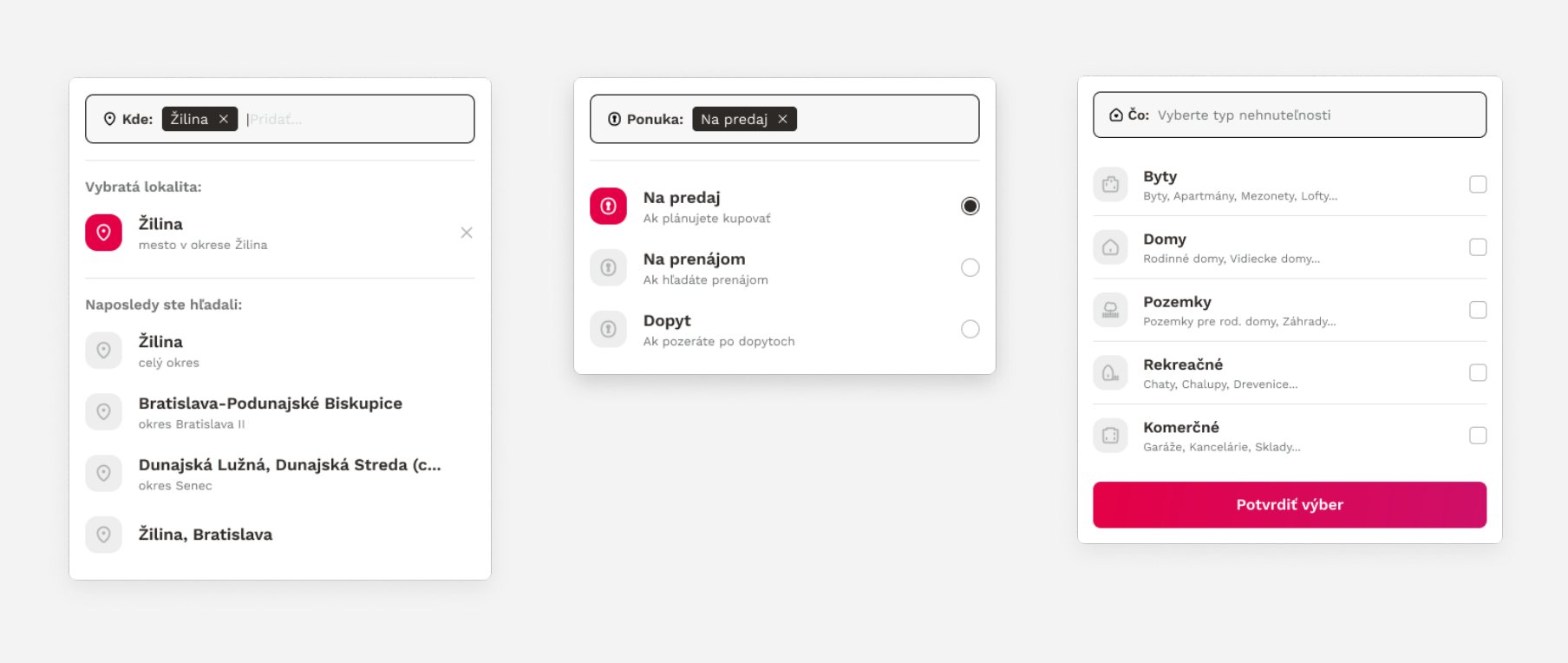
Search inputs
Inputs redesigned to look interactive and clickable, with every state worked out: empty, filled with chips, focused, recent searches and dropdowns.

Last search
Added “last search” under the search bar to reduce repetitive input.

Content of the inputs
Unified wording and input content: clear labels, chips for selected locations and a better hierarchy. Descriptive texts added for “Offer” and property types.
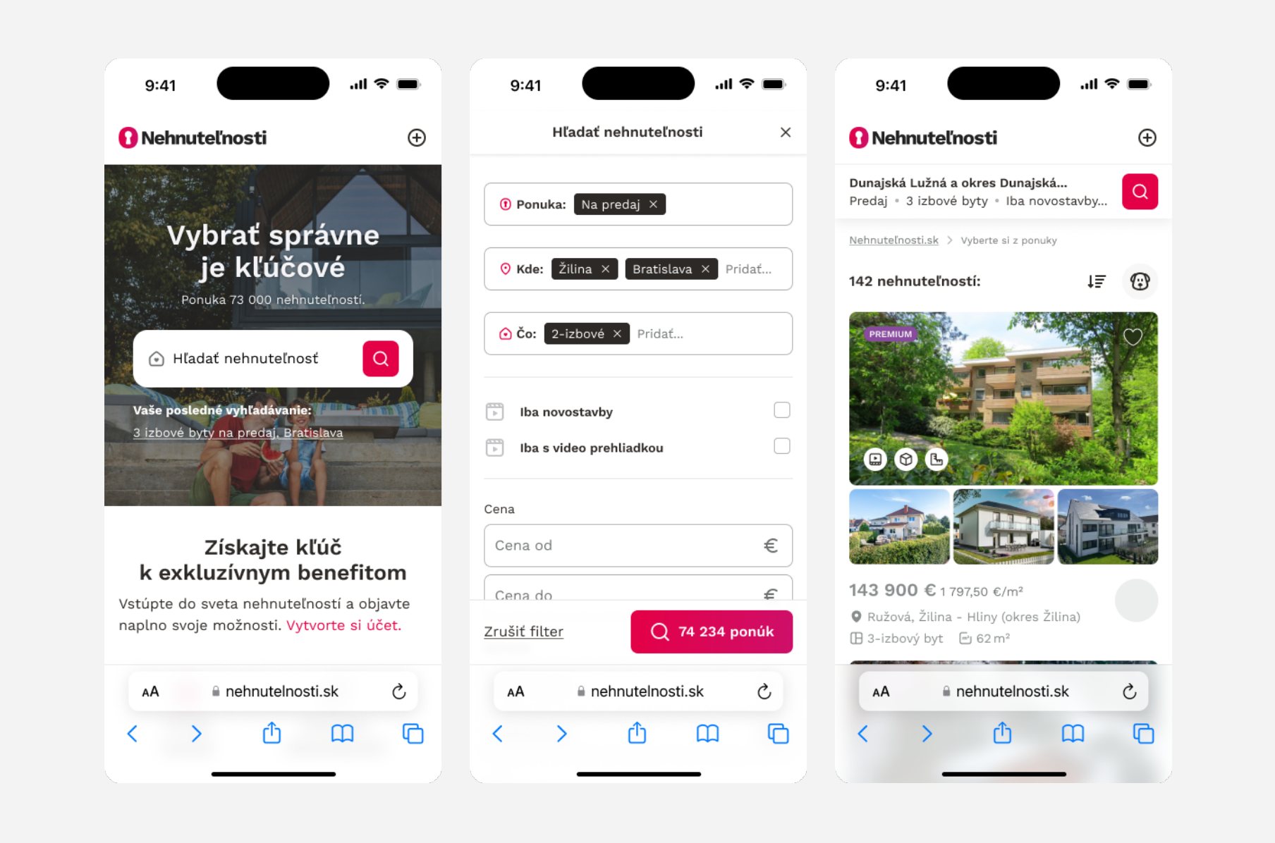
Responsive version
The same logic on mobile: homepage search, the full-screen search form and the results list.
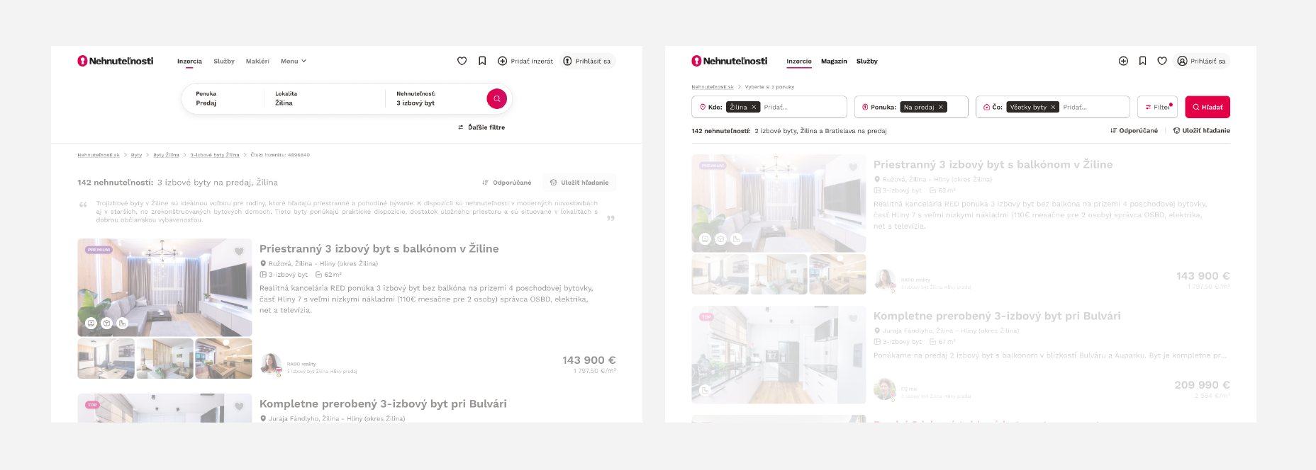
Search results
The changes also affected the search results page.
After release
What users said about the new version
Google Analytics and Hotjar tracked performance and feedback after release. Users were asked: “Please tell us more about why you rated it that way?”
responses. Most of them highlighted improvements in clarity, intuitiveness and mobile usability. The critical ones showed what still needs work.
Positive
“Better than before, graphically more beautiful, simpler and it finally works better on mobile.”
“It looks pretty cool and functional”
“I like it more, it seems faster”
“It's simple and intuitive”
“Everything is intuitive, great”
“Less clicking”
Critical
“The filter has few options, it could have more”
“The old version was much easier to use”
“Less clear”
“The same thing, only in pink, still need to come up with something?”
What comes next
But this adjustment didn’t end there
All identified problems were turned into specific improvements that already make the experience better. This is only the first step: building a foundation for an intuitive, fast and enjoyable product. We are at the beginning of the journey, and the best is yet to come.