United Classifieds — Nehnuteľnosti.sk · 2025
From “Wow” to Walkaway. What makes users decide?
Nehnuteľnosti.sk is Slovakia’s leading real estate portal, with more than 72,000 active property offers and over 1,800 agencies reaching over a million users every month. Every one of those offers has its own detail page, and that page has one job: get the right person to contact the seller.
The goal was to uncover friction points on the property detail page, improve usability and deliver a better browsing experience for each property offer.
| Role | Senior Product Designer: research, user testing, UI design and prototyping |
| Product | The property detail page, desktop and mobile |
| Methods | Hypotheses · mapping what drives a lead · task-based user testing · System Usability Scale · prototype validation through in-depth interviews |
| Result | Findings prioritised by business impact and implementation effort · a redesign that users called cleaner, clearer and more trustworthy |
The starting point
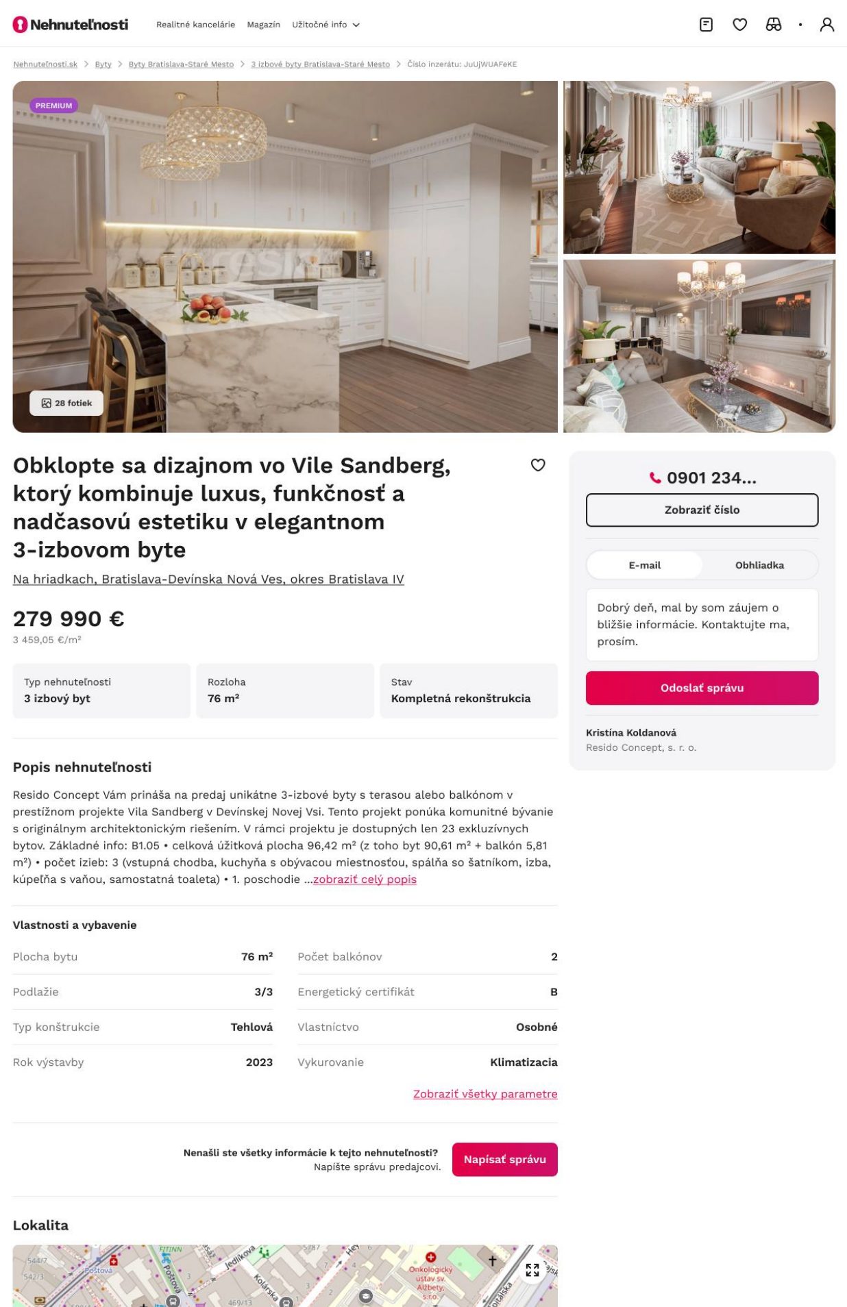
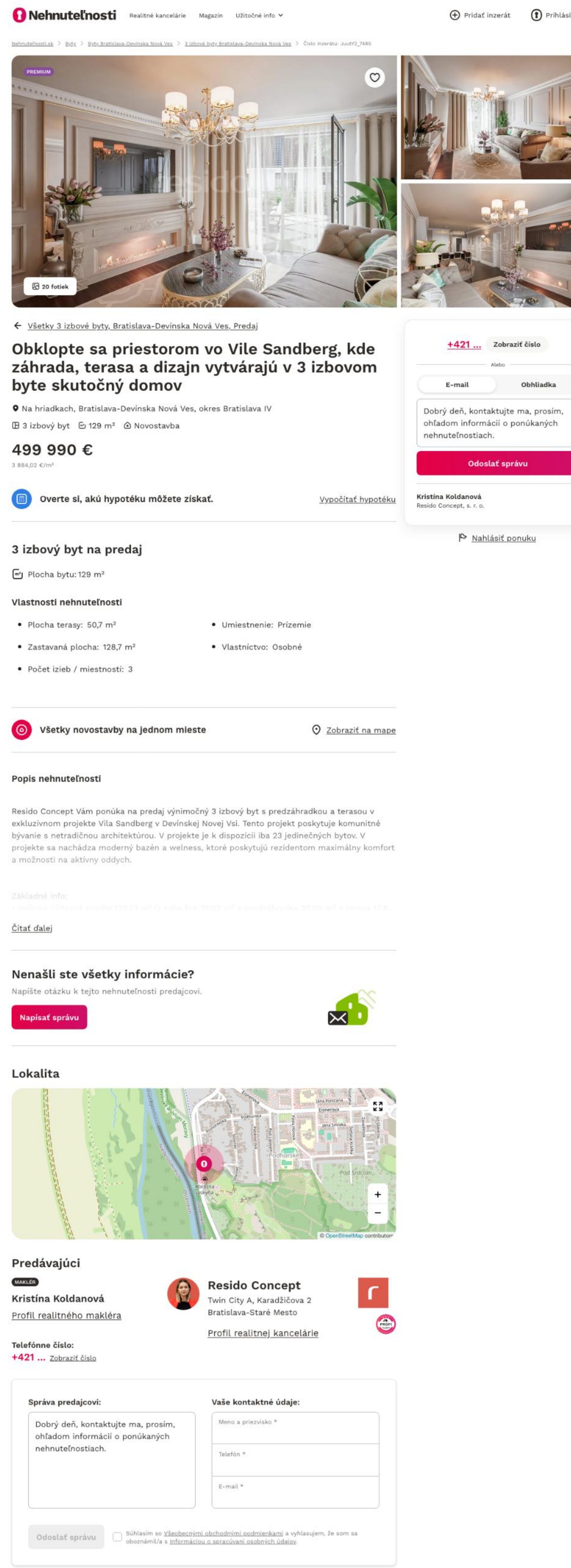
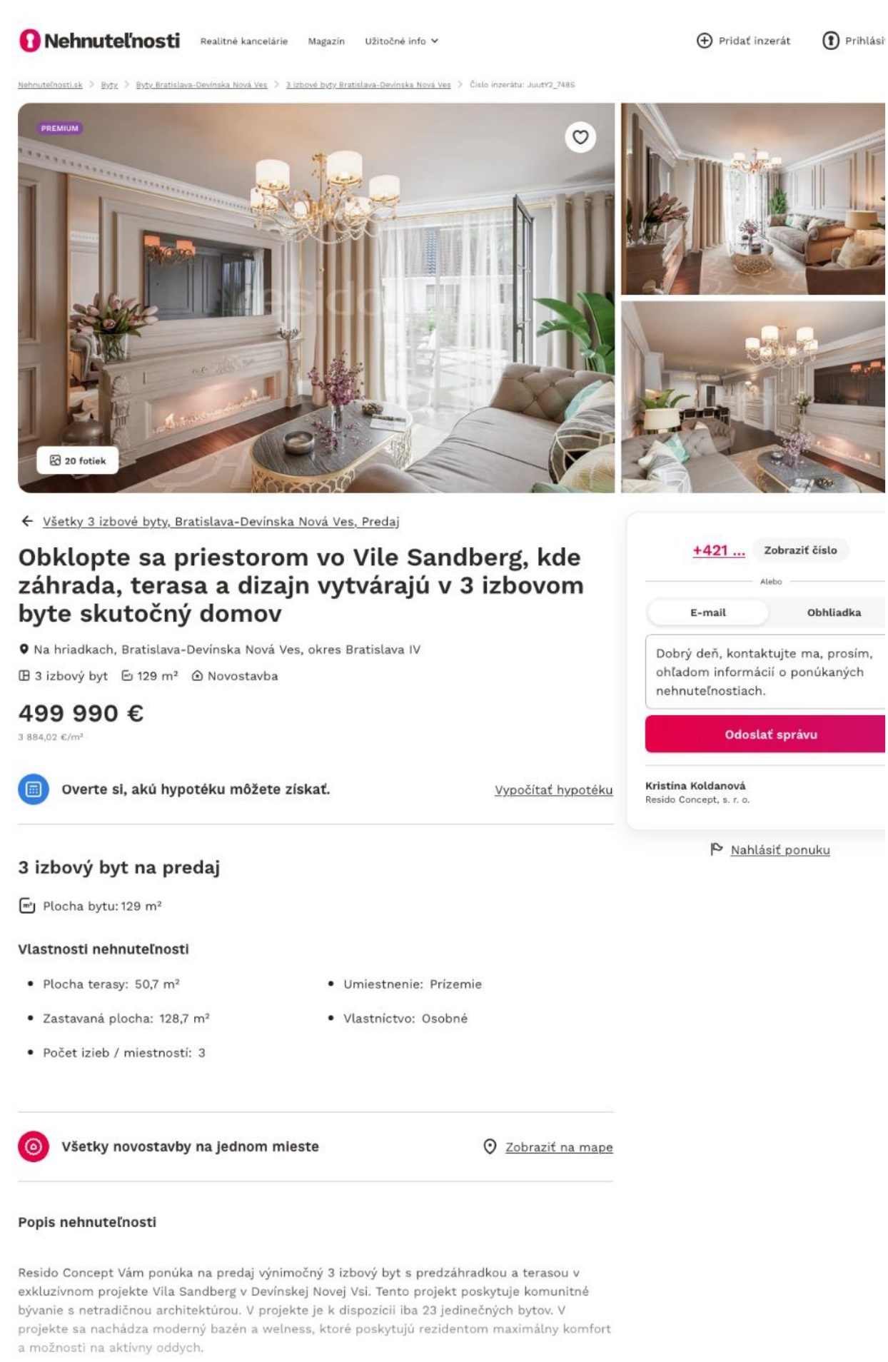
The current property detail page
Photos, title, price, key parameters, a contact box in the sidebar, the description, a map, the seller and a message form at the bottom. Everything a buyer might need was there. The question was whether it helped them decide.
Hypotheses
Questions galore, hypotheses even more
Before making any major changes, I rigorously tested the current property detail page. Only by understanding the real user experience could I design solutions that genuinely help users.
| Contact | When does a user decide to contact the seller?Are photos, location, property type and price enough to spark interest, with the details coming from the seller later? |
| Layout | How do users perceive the layout and importance of information blocks?Price, location, description, features: what do users consider critical when making a decision? |
| Next step | Can users figure out what to do when they find the right property?Do they notice “Show number”, “Email”, “Schedule viewing” and “Send message”, understand them and actually use them? |
| Form | How clear and usable is the “Send message” form?Can users find it? How do they perceive the pre-filled text, the difference between email and viewing, and a “Schedule viewing” tab with a form but no calendar? |
| Gaps | What do users do when information is incomplete or missing?For example a missing floor plan, exact address or property condition. |
| Dead end | What happens when a property offer fails to engage?Do users know how to return to the results or find similar offers? |
| Trust | Which elements build or reduce trust in a property offer?Do users notice them, and how much attention do they actually pay to them? |
Understanding the user
What drives a lead
The foundation was to understand everything that drives a lead: what prompts a user to contact a seller, and which of those factors we can actively influence. That includes data quality, clear key information, trust, user flow, decision-making factors, how users compare offers, emotions and even FOMO, the fear of missing out.
Equally important was reducing resistance to interaction and identifying the elements that spark genuine interest.

User testing
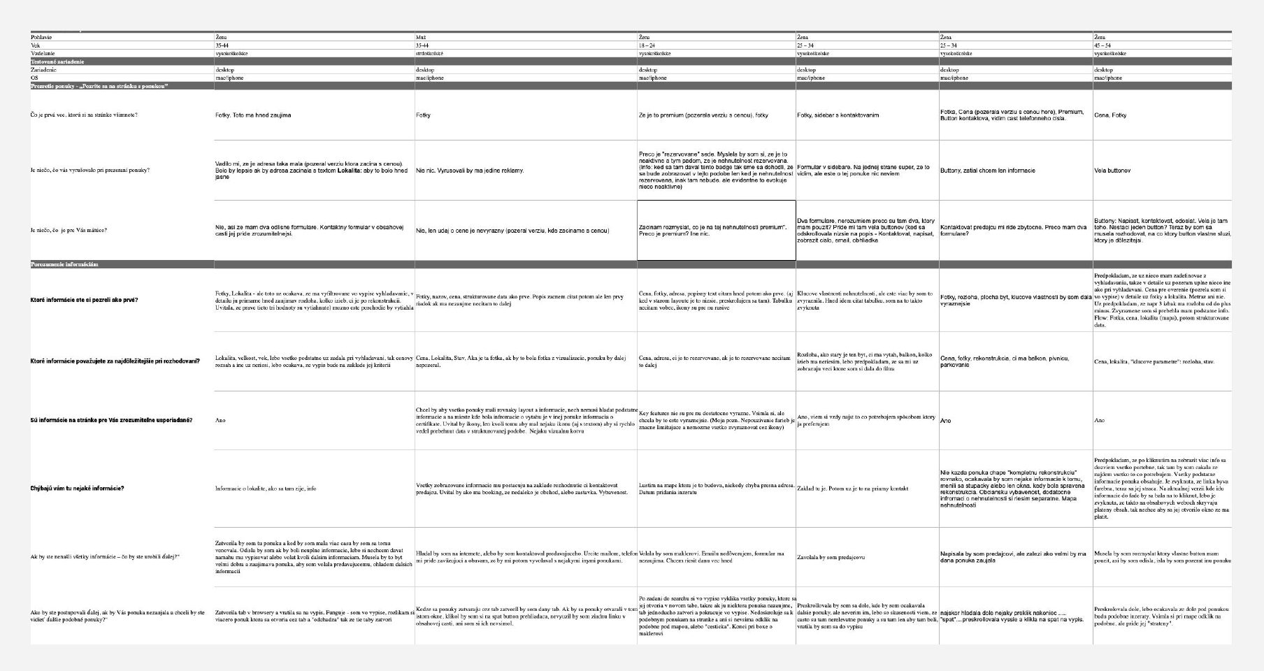
Five tasks on the current property detail
Each task looked at one part of the decision, from the first glance to the final impression.
Take a look at the property detail
Goal. Understand what grabs attention at first glance, how people read the page and where they look for key information. Focus: page layout and clarity.
- What is the first thing you notice on the page?
- Was there anything distracting while browsing the property detail?
- Was there anything confusing for you?
Understanding the information
Goal. Test how users interpret the content blocks, which information they consider important and whether it’s logically organised. Focus: information placement and content.
- Which information did you look at first?
- Which information is most important for your decision?
- Is the information on the page presented clearly? Is anything missing?
- If you couldn’t find all the information, what would you do next?
- How would you proceed if the property didn’t interest you but you wanted to see similar offers?
Contact the seller
Goal. Explore how users perceive the form and the pre-filled message, and whether they edit it. Focus: form interaction.
- Imagine this property caught your interest. How would you contact the seller?
- Which contact method do you prefer and why? Phone, email, or something else, like Messenger, WhatsApp or booking a viewing online?
- What’s the difference between “Email” and “Schedule a viewing”? What do you expect after clicking “Message the seller”?
- Does the pre-filled text help you, or would you rather write your own message?
Perceived trustworthiness
Goal. Understand whether users trust the property offer based on the information and visual cues it shows.
- What makes this property offer look trustworthy to you?
- What additional information would make you feel even more confident?
Final discussion
- What is your overall impression of the page?
- Was the map on the page helpful or not?
- Would you appreciate an option to receive similar offers by email?
- What would you improve? Is anything missing?
- Do you prefer searching like this on mobile or desktop?
System Usability Scale
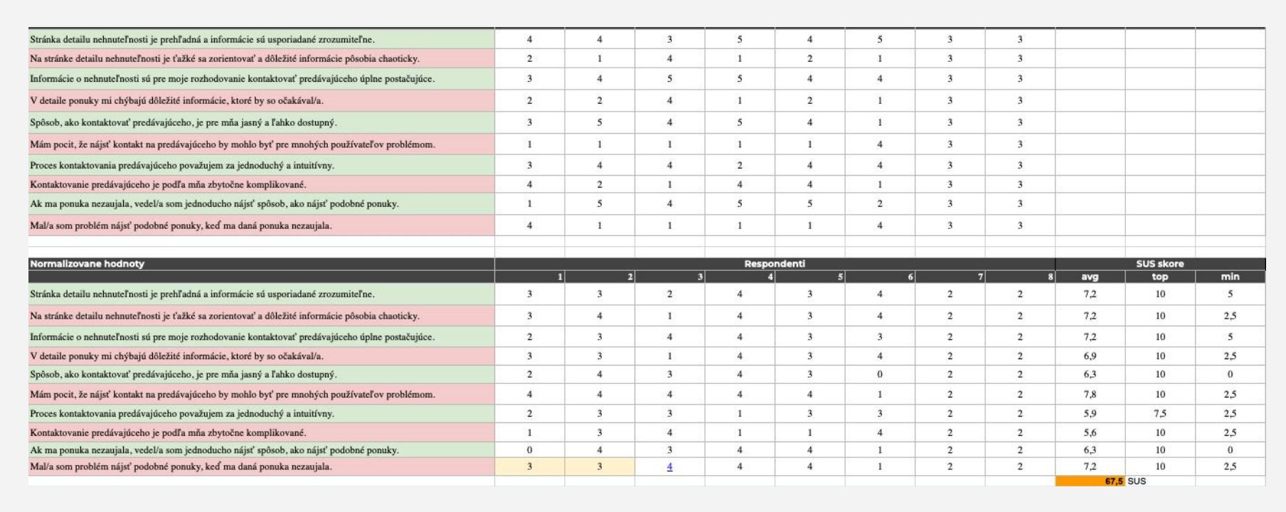
SUS is a reliable tool for measuring usability: a questionnaire of 10 statements, each rated on 5 points from strongly agree to strongly disagree. Positive and negative statements alternate.
- The property detail page is clear, and the information is organised in an understandable way.
- It is difficult to navigate the property detail page, and important information feels chaotic.
- The information provided is sufficient for me to decide to contact the seller.
- The property detail lacks important information I would expect to see.
- The process for contacting the seller is clear and easily accessible.
- I feel that finding the seller’s contact could be challenging for many users.
- Contacting the seller feels simple and intuitive.
- Contacting the seller seems unnecessarily complicated.
- If a property didn’t interest me, I could easily find a way to discover similar offers.
- I had difficulty finding similar offers when the current one didn’t interest me.
Evaluation
Every insight ranked by impact and effort
User testing and detailed analyses revealed many opportunities to take the product to the next level. Each insight was assessed and prioritised by its potential business impact and implementation effort. Due to the internal nature of the data, detailed results and specific findings can’t be disclosed.

Findings
Each insight from testing became a concrete task.
Design
The tasks were gradually built into the redesign, with prototypes for desktop and mobile.
Prototype and further testing
Validating the redesign in interviews
Insights from user testing set the direction for the new design. Each finding was translated into concrete tasks that fed directly into the design process, leading to prototypes optimised for desktop and mobile.
Once the prototypes were ready, I ran a series of validation tests through in-depth interviews, to make sure the proposed solutions really addressed the issues found in the initial research. This let us fine-tune the design to real user needs while delivering business value: clearer navigation, faster decisions and a better overall experience.
Feedback on the updated property detail
“It feels cleaner. More information is available in a smaller space, and it’s easier to navigate.”
“It looks more professional. The updated layout inspires more trust.”
“Modern feel, highlighted property features, and sidebar improvements make the page more enjoyable.”
“The new version is clearer and feels simpler.”
“Cleaner, more organized, the property detail is easier to read overall.”
The outcome
Be prepared to be pleasantly surprised
Due to the internal nature of the data, I can’t reveal everything. :)
Current version
Maybe :) a new design